Happy Gardens of Austin
Overview:
Happy Gardens of Austin is a landscape design company based in Austin, TX that specializes in native plant design.
The owner of Happy Gardens of Austin was concerned about the messaging and overall aesthetic of her website. It lacked cohesion with her Instagram account and was not user friendly.
Role
Co-designer
Timeline
3 weeks
Tools
Figma
Google Sheets
Toggle
Zeplin
Problem:
Users need a company’s website to provide clear and easily accessible information so that they can use it as a tool to understand the business and the services it offers.
Research:
Heuristics evaluation
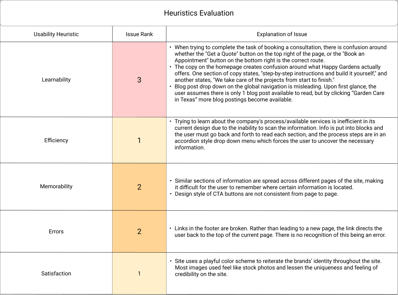
Evaluation confirmed that current website lacked clear information about the services Happy Gardens of Austin provides.

Happy Gardens of Austin is a landscape design company. It does not offer construction or maintenance services.
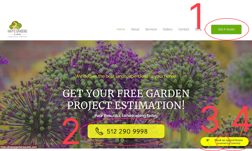
There were 4 different call to action buttons on the homepage.
With an idea of the issues on the current website we developed an hypothesis.
The information architecture on Happy Garden of Austin’s website leads to confusion about the services the company provides.
In order to test our hypothesis we conducted 4 usability tests of the current website.
- Tell me about what you think this business/site offers?
- How credible/trustworthy does this site feel?
- Show me how you would go about scheduling a consultation.
- Explain the landscape design process.
- What is Happy Gardens of Austin?
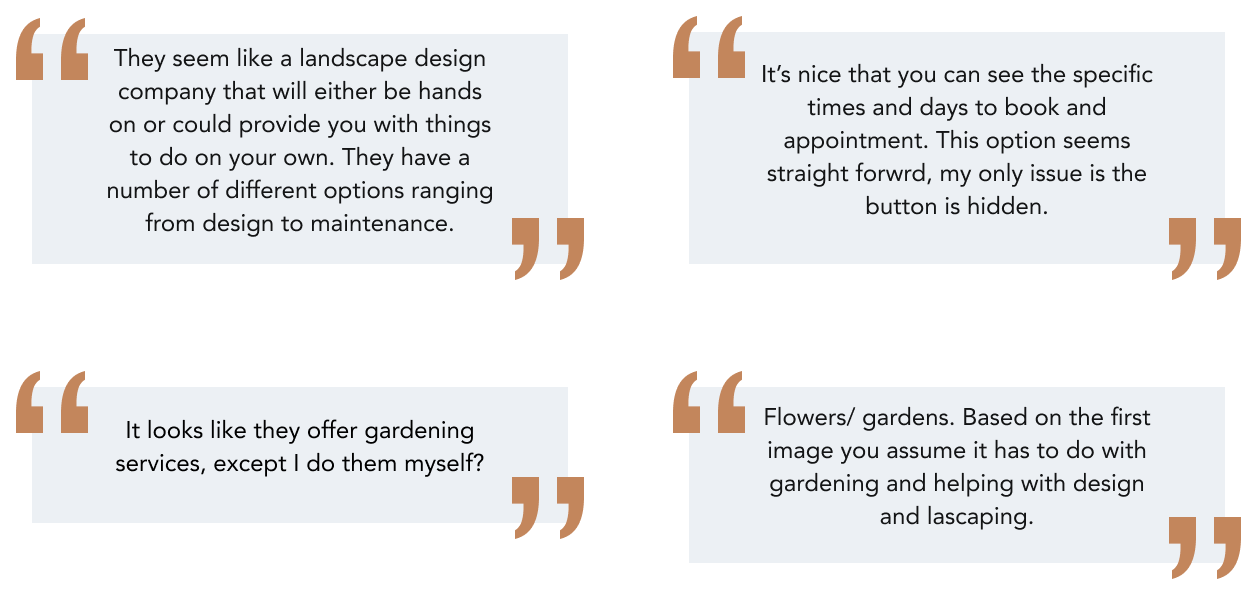
Users were unable to explain what Happy Gardens of Austin is. There was a general understanding that Happy Gardens does some type of landscaping, but users were unsure if they focused on flowers, landscaping, DIY projects or design. Due to the confusing messaging on the current website users were unable to explain the landscape design process. Additionally, users did not understand how to contact Happy Gardens of Austin. There were too many call to action buttons.
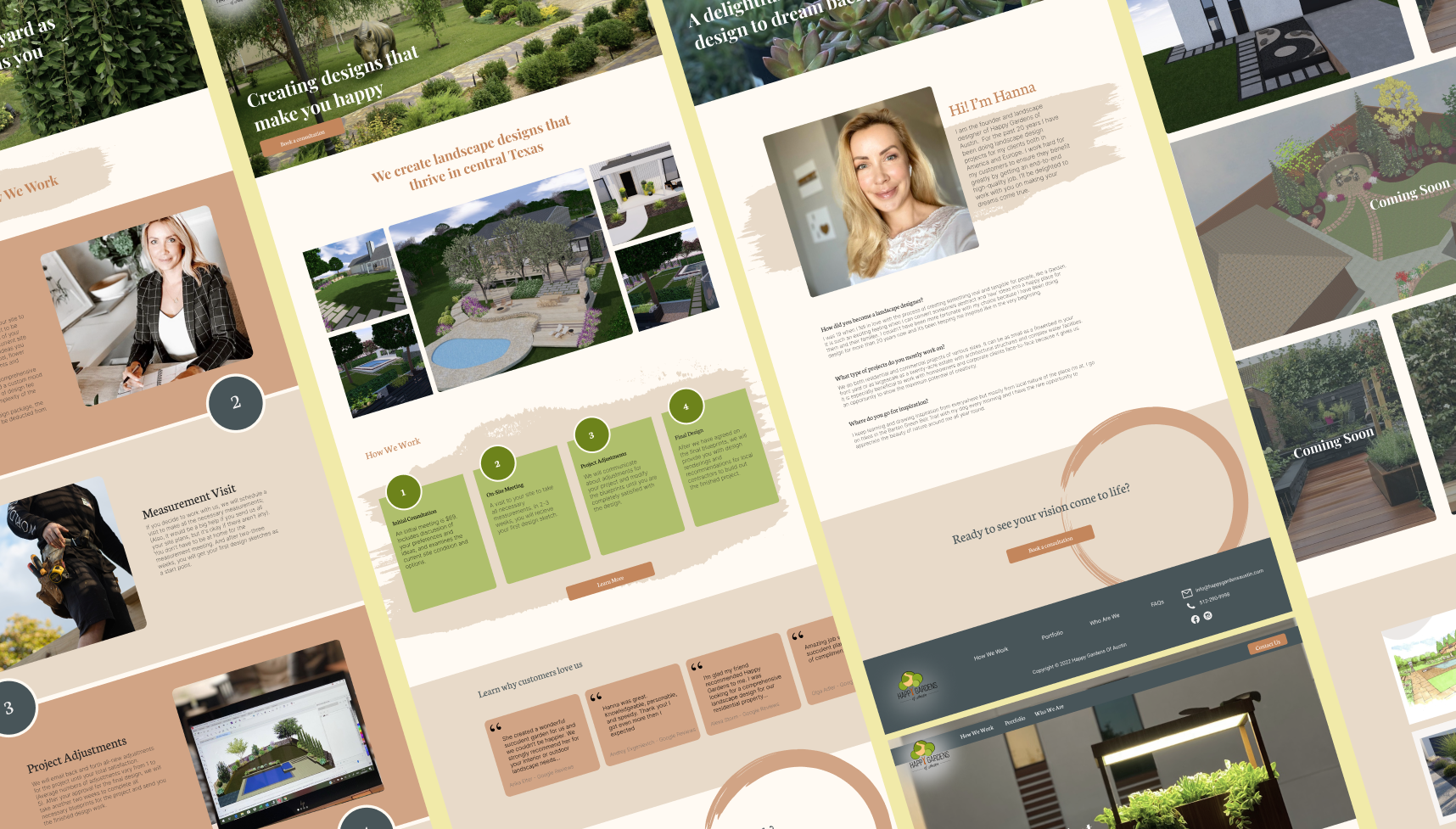
Design:
Focus on information architecture.
Sketches:
Design studio for ideation.
Wireframes:

Lo-fi prototype to test wireframes. Testing revealed that issue of messaging had been solved. 4 out 6 users were able to clearly explain what services Happy Gardens of Austin provides.
Testing:
Focus on portfolio page to highlight Happy Gardens of Austin’s work.
Users prefer the final iteration (the one on the far right). The mosaic was visually appealing and brought the most joy to the page.
Prototype:
Learnings:
- 4 out 6 users were able to precisely describe what Happy Gardens of Austin does
- Users were able to explain the design process
- Users felt the website was light and airy and the color palette reminded them of Austin
- Users were able to easily schedule a consultation using clear and consistent CTAs.
- Users enjoyed seeing pictures of finished client projects along with blueprints and rendering
Happy Gardens of Austin has a website with clear messaging.
Next Steps:
Build out more case study pages on the portfolio page and add more pictures of client project in phases.
Include more information about pricing on the website.