Sterling Place
Overview:
Sterling Place is a home goods store located in Brooklyn, NY that carries unique and eclectic tic products. Currently the aesthetic of the brick and mortar store does not translate to it’s online presence. My goal was to redesign Sterling Place’s website to make it echo the quality of the store and encorporate responsive design.
Role
UX Designer
Timeline
2 weeks
Tools
Figma
Google Sheets
Google Slides
Problem:
USers need clear call to action buttons to seamlessly navigate Sterling Place’s website to make the online shopping process efficient and enjoyable.
Discovery:
I began this project by going through Sterling Place’s current website looking for pain points and anything that stood out to me. Immediately I noticed some parts of the website were confusing and left me feeling frustrated. The way items were categorized (the global navigation) did not make sense and there was no ability to continue shopping after adding an item to your cart. This was surprising to me because as a business you want customers to keep shopping. By taking them right to checkout you are losing business and frustrating your customers.
The image below shows what happens when you add an item to your cart.
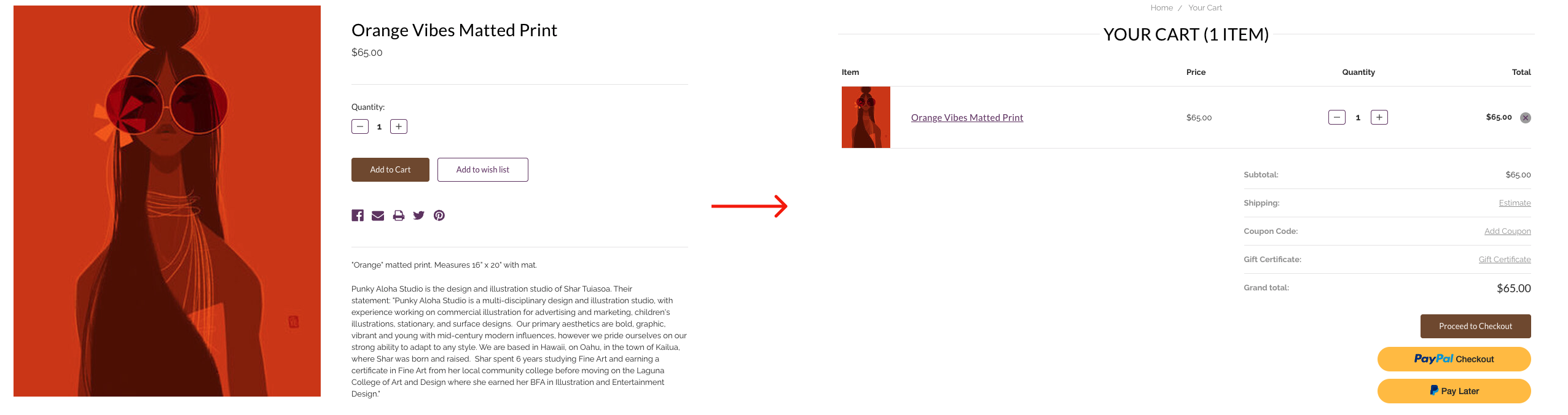
After adding the item to your cart you are immediately taken to your shopping cart and your only option is to proceed to checkout. Users often want to keep shopping after adding and item to their cart, so this does not make sense.
Now that I identified some potential issues with the current website I needed to confirm my initial findings. I tested the current website with 3 users. They were asked to find a sofa and then walk through the checkout process. The testing confirmed my initial findings. Users struggled to locate a sofa because there was not a clear category to search for a sofa. Being that Sterling Place sells furniture, users thought this was odd. Additionally, users were frustrated that after adding an item to the cart they were immediately taken to check out. With my initial findings confirmed I was ready to dive further into research.
The Research:
I began by using a feature analysis to compare the features on Sterling Place’s website to two of its national competitors.
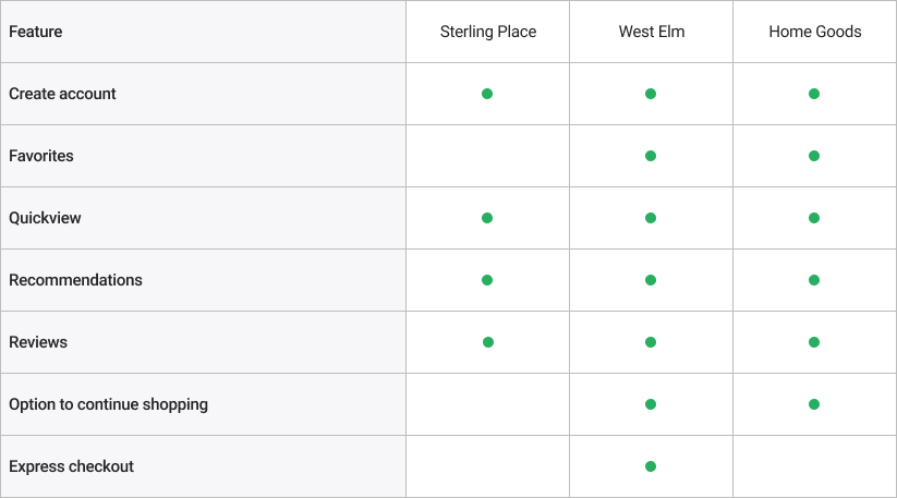
The feature analysis confirmed my initial findings. Sterling Place was at a disadvantage by not having the option to continue shopping after adding an item to your cart.
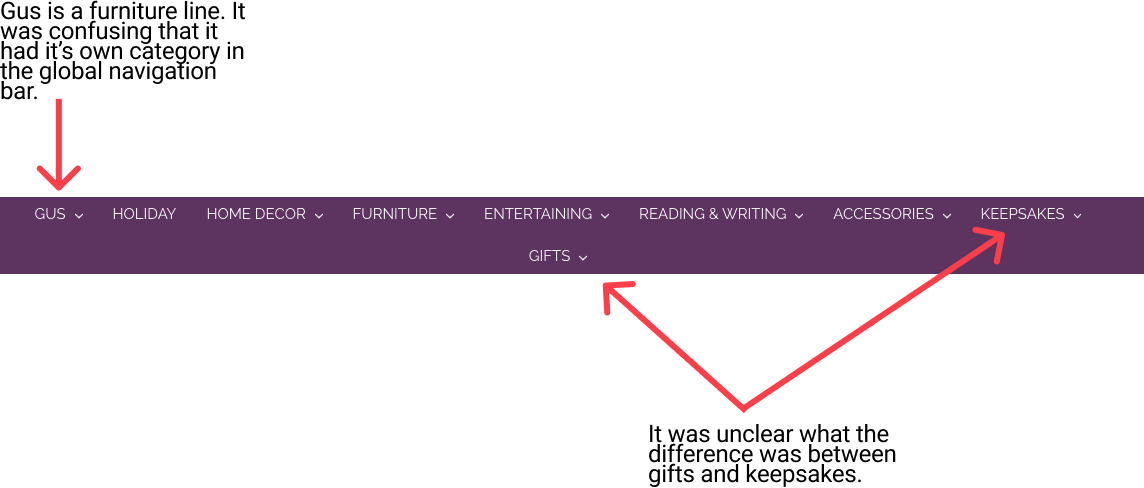
The original global navigation bar was confusing for users. The categories listed were unclear and having two rows to sort through felt overwhelming.
I used a card sort to see how people would intuitively categorize items. Users sorted the objects into 7 different categories, which is a big difference from the 9 currently on Sterling Place’s website.
Sitemap:
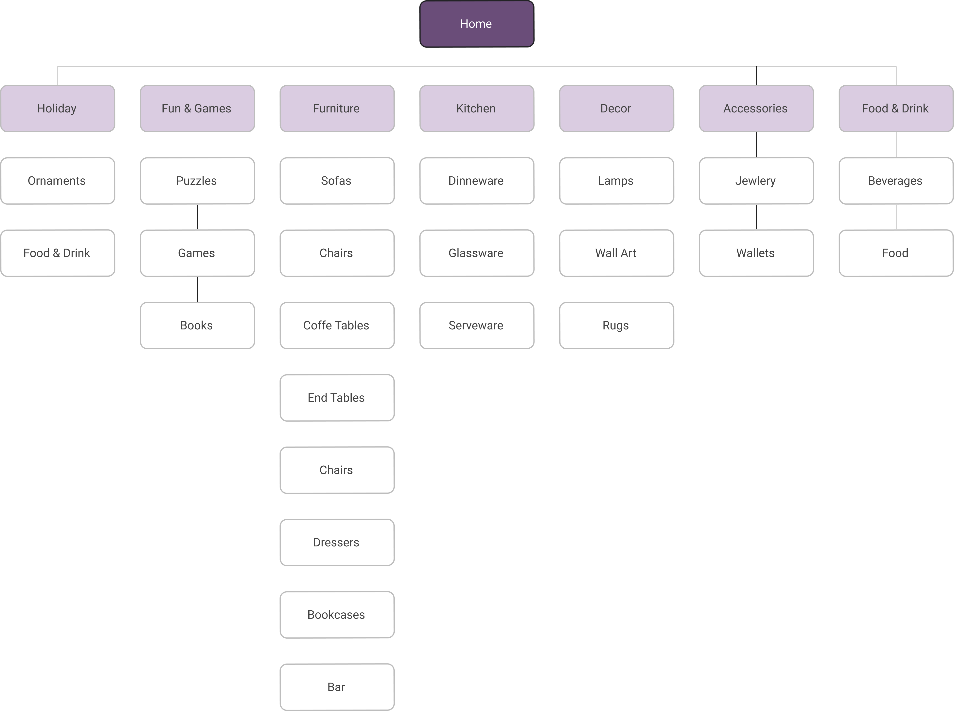
Now all of the categories will fit in one row on the global navigation bar making it easy for users to find their desired category and begin shopping.
With two major issues tackled, I was ready to move onto creating a user persona.
Meet Rachel:
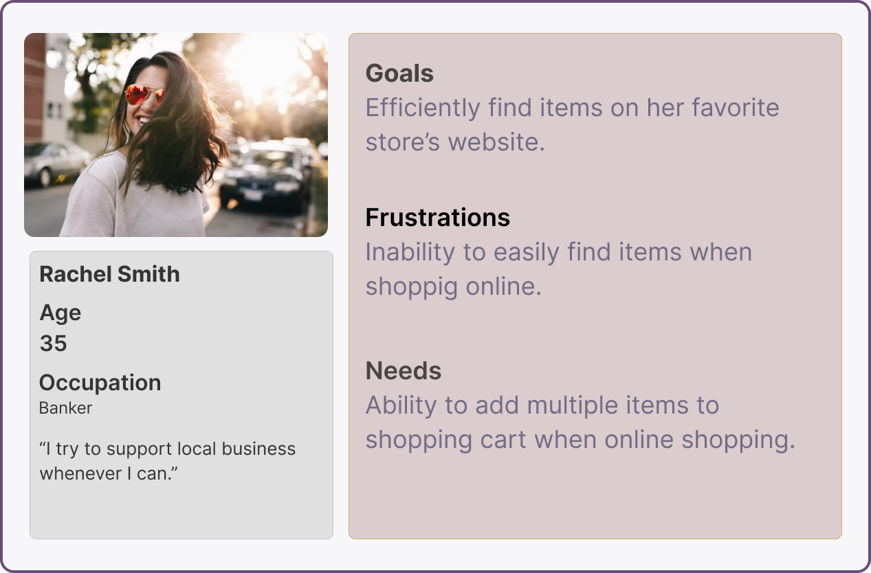
Problem Statement:
Rachel needs clear call to action buttons to seamlessly navigate Sterling Place’s website to make the online shopping process efficient and enjoyable.
The Design:
When redesigning Sterling Place’s landing page I wanted it to be easily scannable so that users could find their desired product without frustration.
Lo-Fidelity:
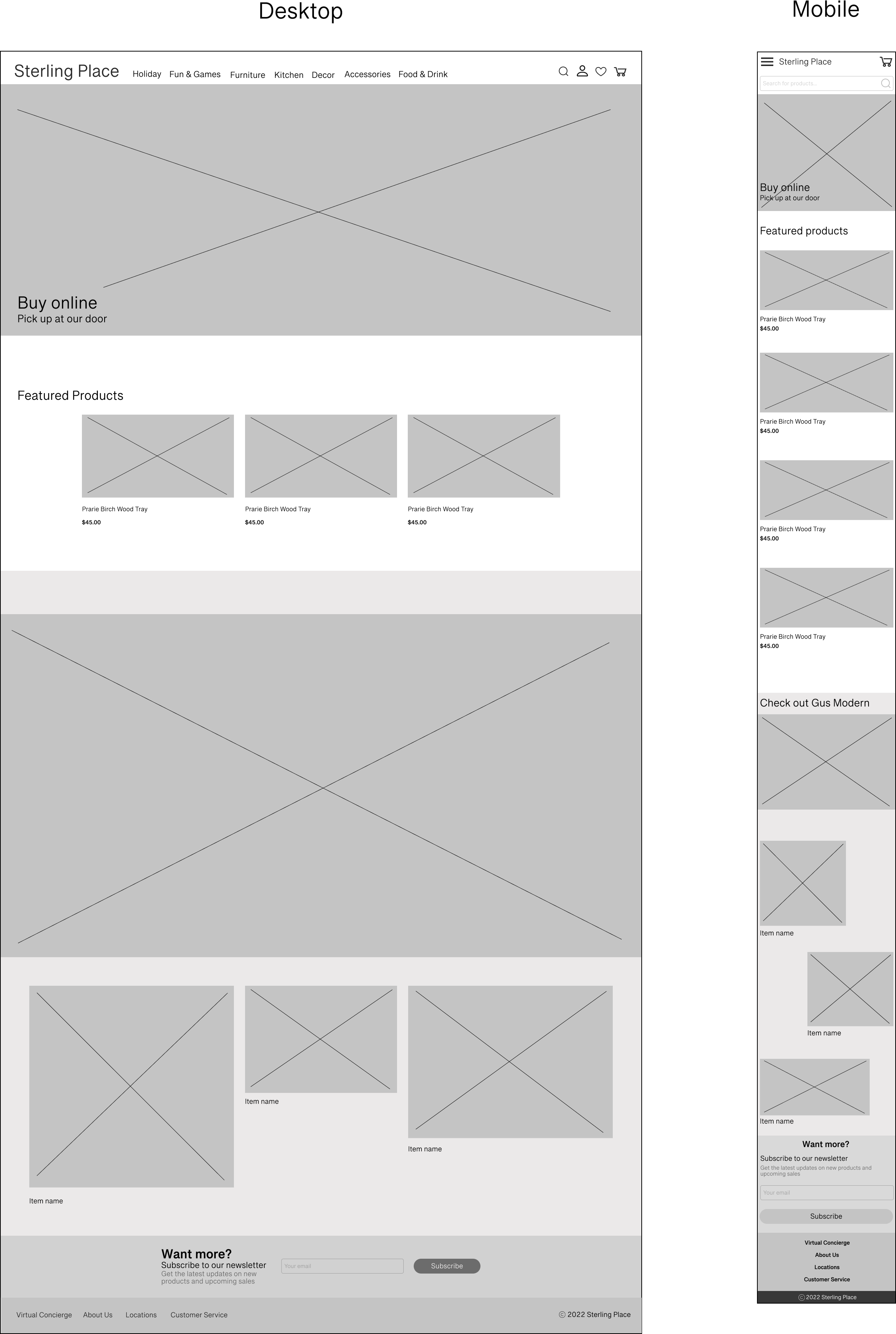
With changing the categorization of items users were able to quickly and easily find their desired product. Users also expressed enjoyment about the simplicity of the page.
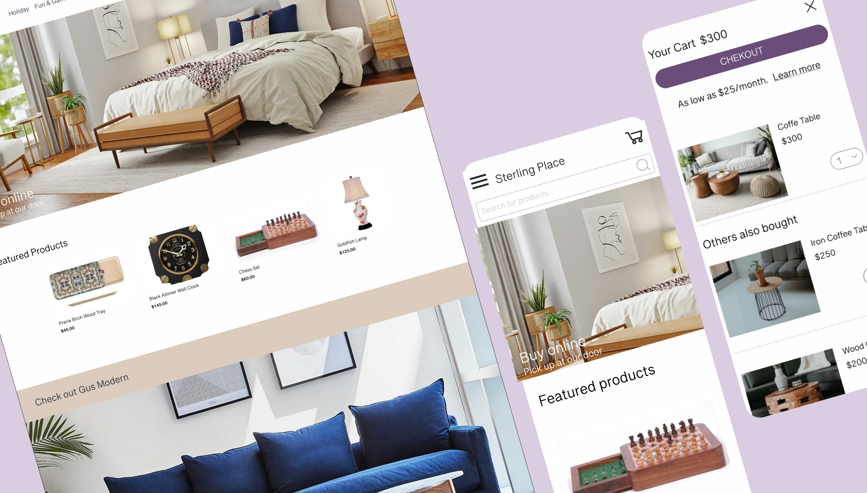
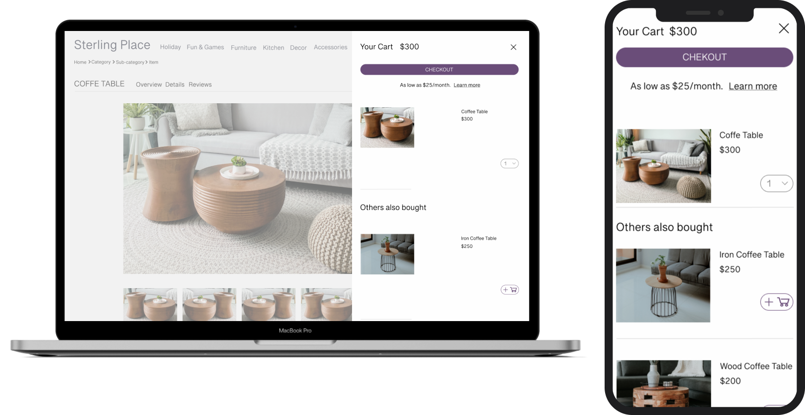
I redesigned the shopping cart to make it easier for users to continue shopping after adding an item to the cart.
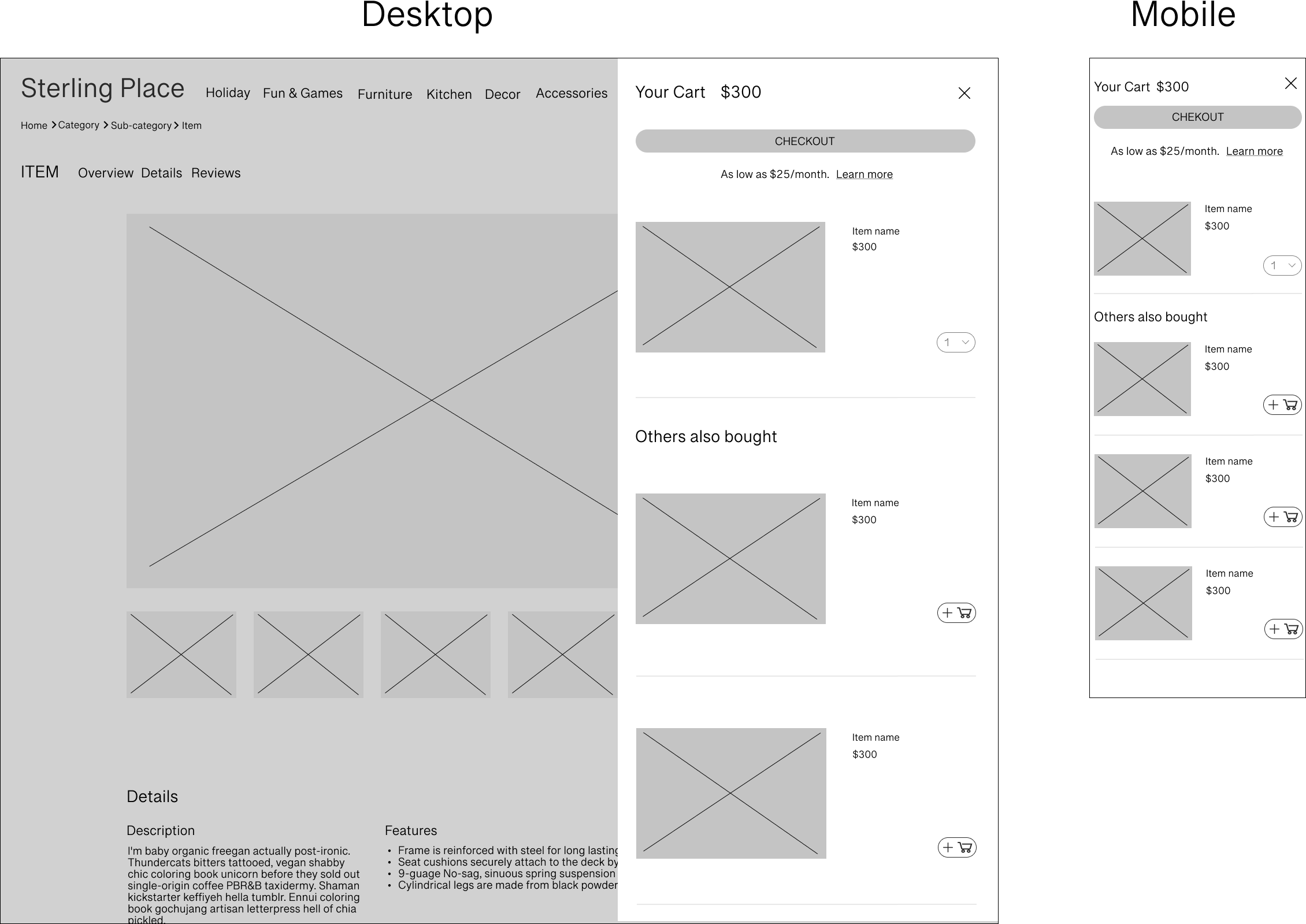
On both desktop and mobile the shopping cart is a pop-up, which would allow users to see what was in their cart and then easily keep shopping.
Users responded positively when testing the lo-fidelity wireframes, so I was ready to move onto hi-fidelity.

Hi-Fidelity:
Landing Page:

Shopping Cart:
Next steps:
To further develop this project the next steps would be to build out more pages to do a full redesign of the website.