Happy Plate

Overview:
Happy Plate is a marketplace where people with long term health issues can purchase customized chef prepared meals that fit their specific dietary needs and have them delivered to their homes. Happy Plate is unique in that each meal is prepared after having an in depth phone consultation with professionals to ensure that meals are aiding the overall health of clients.
Problem:
Users need an affordable meal delivery service that caters to their health needs because they are tired of eating the same meals over and over.
Discovery:
At the start of the project my team was very excited by the concept of Happy Plate. We knew of plenty of meal planning services, but none were so targeted or specific. As we began to sift through Happy Plate’s website we immediately realized there were major issues blocking Happy Plate from being a successful platform.
Happy Plate’s website appeared to be outdated and we questioned its functionality.
“This could just be in the yellow pages.”
Before:
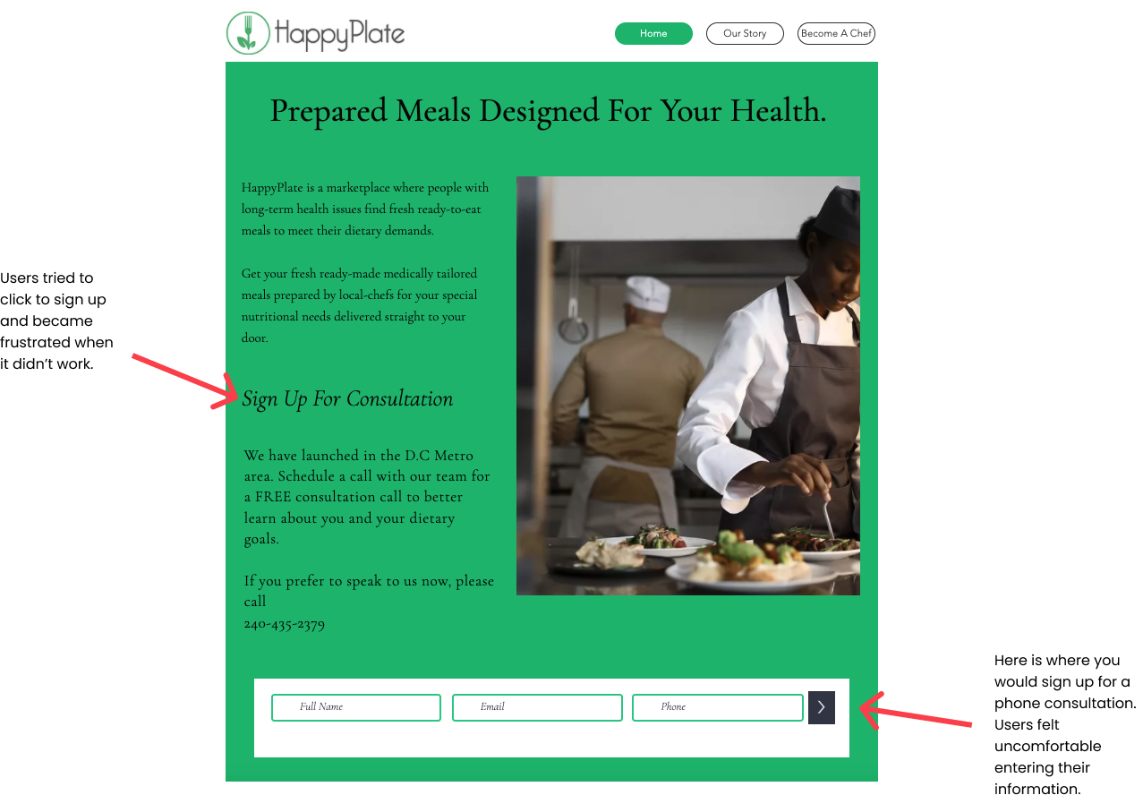
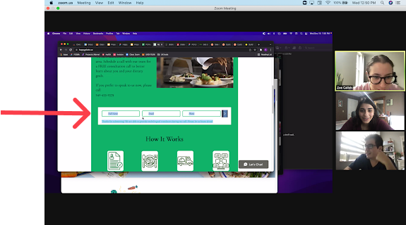
Users were put off by the appearance of the current website and didn’t understand/ couldn’t find how to sign up and use the service. My team attempted to input our information and get a consultation call. We encountered the same issue that users had. It was impossible to understand the sign up process.
After entering your information a tiny row of text appeared letting you know that you entered your information correctly. However, the row of text was only visible for a few seconds. If you weren’t paying close attention you would miss it.
The Research:
We knew that Happy Plate was a special product, but we wanted to do some market research to see what exactly made Happy Plate shine and where it’s services were lacking.
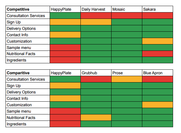
Our competitive analysis showed that Happy Plate’s consultation service does make it stand out compared to its competitors. However, their lack of a sample menu, nutritional facts, list of ingredients, and confusing sign up/ contact was a major disadvantage. The comparative analysis further echoed what Happy Plate was lacking.
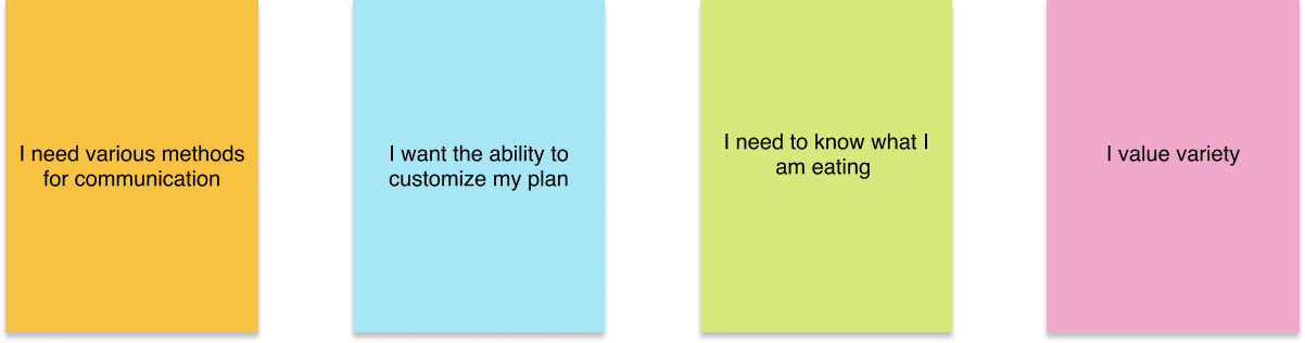
Now that we knew what the market standard was we interviewed people who had chronic health conditions to ensure that we were in line with the product. After synthesizing our notes we developed 4 “I statements” that showed what our users really wanted.
Now that we knew our users wants and needs we were ready to define our target user.
Meet Alex:
“I want a personal chef, who isn’t a personal chef.”
Alex has celiac disease. She craves delicious and healthy food that is gluten free, but is not the best cook out there and doesn’t have tons of time to work on improving her culinary skills. She has tried meal plan services in the past, but has been frustrated by the lack of variety in foods that are safe for her to eat.
Alex’s Problem:
Alex needs an affordable meal delivery service that caters to her health needs because she is tired of eating the same meals over and over.
The Design:
Now that we knew what our users wanted we were ready to start designing. Our goals were to create a clean landing page that gave first time users clear calls to action on how to sign up for Happy Plate and there needed to be a survey/ questionnaire for users to fill out.
With our goals in mind, we held a design studio where each out of us spent 3 minutes sketching out each frame of our user flow. From there we discussed each of our designs and combined the strongest idea’s from each team member to create low- fidelity wireframes.
Wire flow:

We created wireframes and tested them to see if there were any pain points in our current design. We found that the last page of our questionnaire (the thank you page) was confusing.

Users were distracted by the large image of the sample meal. It caused them to miss important information on the page.
Back to the drawing board:
We conducted a mini design studio focusing on our thank you page.
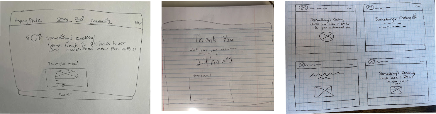
After combining the strongest parts of each design we developed our new thank you page.

We changed the wording from “thank you” to “something’s cooking…”
We highlighted important information.
We made the image of the sample meal smaller so it would not be a focal point of the page.
After testing the updated thank you page we conducted another round of testing. Users enjoyed the playfulness of the wording “something’s cooking…” and expressed that the page gave them clear next steps.
Final Design:
The learnings:
Our goal was to improve the functionality of Happy Plate’s current website and we achieved that goal by making clear call to actions on the landing page and creating a questionnaire for users to fill out before scheduling a consultation.
Next steps:
Users enjoyed using the questionnaire, but we believe the questions should be revised and tweaked to meet the needs of Happy Plate further. Our initial usability testing found confusion over the “Our Story” page on the current website. In the future, we would like to iterate on the “Our Story” page to bring clarity and understanding of the value of Happy plate.